


If you want to create a winning website that’s fast, beautiful, and attracts potential customers – it needs to be responsive. There are plenty of benefits of responsive web design for SEO, but also for everyday applications and use.
So let’s take a closer look at all the potential and genuine benefits of responsive web design for SEO and how it can shape and transform your business. But first, let’s answer some burning questions.
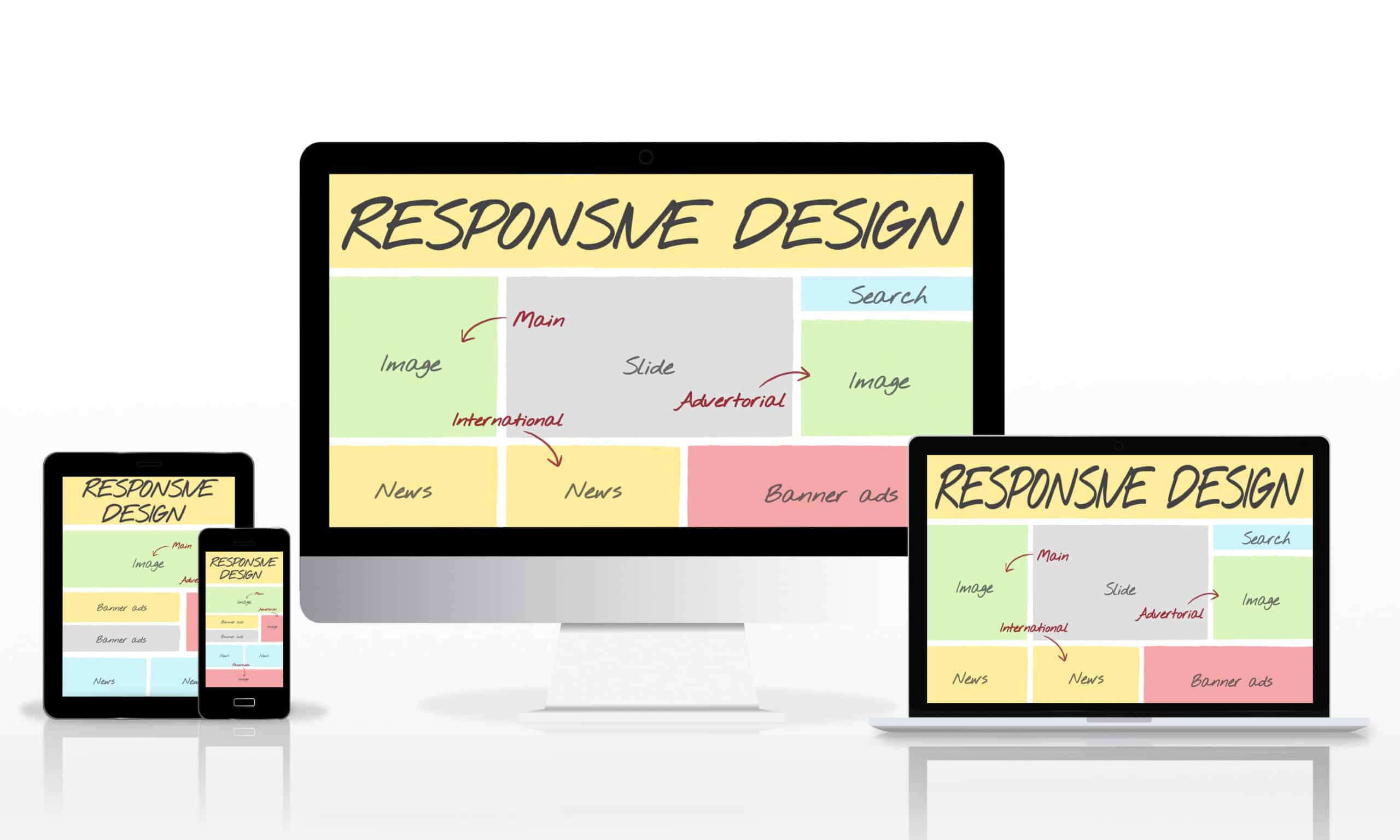
What Is Responsive Design?
Responsive design is an approach to web development and customization that suggests both the design and the development should respond to user behaviour. That’s to say the web design needs to work and look great, no matter the screen size, platform, or orientation the users choose.
The practice of a responsive website consists of a mix of flexible layouts, grids, and images, as well as clever use of CSS media queries. As a user switches from one device to another, the website should switch with them and work no matter the device or platform.
In other words, a web designer should ensure that the website is technologically sound enough to respond to the user’s preferences. The practice of responsive web design should eliminate the need for a different design and development plan phase for each new app, site, or gadget on the market.
Why Responsive Design Is the Future of the Web
In addition to the many benefits of responsive web design for SEO (which we’ll get to soon), many consider this type of design to be the future. For one, having a responsive site is pleasant to your readers as adaptive designs are guaranteed to work well on screens of any size. That is a must-have as internet use keeps evolving and users often like to read, watch, or shop on the go.
Not only that but responsive designs also load faster, as they only need to load one layout that works across multiple platforms. On the other hand, an adaptive design needs to load all possible layouts for all potential platforms, which can take quite a bit of time.
Finally, having a responsive design means being pretty much future-proof. As it’s not limited to the designated screen sizes, your pages will look great on Androids, iPhones, computers, tablets, and more, regardless of screen dimensions.
The 11 Benefits of Responsive Web Design for SEO
When it comes to the many advantages of responsive web design, the most important thing to know is that user experience (UX) and search engine optimization (SEO) always go hand-in-hand. No matter the industry, design goals, or budgets, SEO and UX need to come together to have a successful website.
Here’s what that looks like and all the potential benefits of a responsive web design a business can reap.
#1 Search Engines Prioritize Mobile-First Websites
In recent years, search engines like Google have started prioritizing mobile-first websites. That’s because 55% of all internet traffic comes from mobile devices and a whopping 92.3% use their phones to access the internet.
Taking into account that there are 4.32 billion active mobile internet users, it has become increasingly important for websites to be easily rendered on any device.
Google, like most search engines, aims to provide both valuable and accessible content to its users. It does so using algorithms that look for websites that check all of those boxes, taking speed and responsiveness into account.
#2 Improving Usability
We can’t talk about the benefits of responsive web design without mentioning Time on Page. Time on Page is a key metric that shows whether users are resonating and responding well to the website and the content on it.
Through responsive design, web developers and designers can make a website faster, more accessible, and easier to navigate. The more responsive or easier to navigate a website is, the more it will encourage users to stick around longer and explore. What’s more, ease of use and simple navigation might also encourage them to return to your site again instead of a competitor’s.
In addition to extending Time on Page, a responsive design will also help encourage users through the marketing funnel. That means that the process of becoming first-time visitors to paying customers becomes much quicker and more optimized with a good digital marketing strategy and responsive site.
#3 Bettering the Customer Experience
Speaking of making customers stick around longer, a responsive website can also make for a better customer experience. When going through the design process it’s important to remember that search engines like Google are concerned with keeping their users happy. They do so by showing them relevant content and one that they’re most likely to engage with.
By creating a user-focused experience, Google and other engines will reward you with a better ranking on their search engine result pages or SERPs. Again, for a website to grab the premier top spots on pages, search engine optimization and user experience have to work together in harmony.
#4 Creating Lasting Results
The thing about high-quality websites is that once they’re done right, they don’t need to be redone for a really long time. While the only way to ensure customer satisfaction and responsiveness is to do regular maintenance, well-developed sites don’t require a lot of work once they’re done.
Search engines will take note of your responsiveness and reward the job well done with lasting SEO benefits. By reaping the benefits of responsive web design for SEO, your website will get better rankings. That will, in turn, bring in more visitors and potential customers. And when it comes to rankings, it’s much easier to remain on top than it is to get to it.
#5 Building Solid Foundations
When it comes to the on-page ranking factors for your site, most of that is going to fall on your web development. Without a solid and responsive design, you won’t have a solid foundation on top of which to build your digital marketing strategy. Without it, most, if not all, of your SEO efforts will go to waste.
#6 Lowering Bounce Rates
A bounce rate refers to the time it takes a user to open and then immediately close your website. It’s a helpful metric that shows whether you’re answering the questions your target audiences are asking.
A high bounce rate can not only indicate that you’re not giving users what they need but also that the loading speed is poor. All that is to say is that the bounce rate is affected by much more than just content.
If your web design makes it difficult for users to navigate the site or to find the answers they need, they’re likely to click off almost immediately. It’s also worth mentioning that on the internet, you only have a split second to make a good first impression.
#7 Faster Loading Speed
Speaking of making a good first impression, faster loading speed is one of the biggest benefits of responsive web design. Loading speed is an essential SEO ranking factor, which means that a responsive design can make or break your site.
What’s more, how quickly your website loads will determine how long users stay on it and how quickly they leave. With mobile responsiveness, web developers are able to improve site speed across all devices and platforms.
#8 Avoiding Duplicate Content
When site responsiveness becomes one of your top concerns, you’re sure to start paying closer attention to UX and content, too. Even though a responsive design is the determining factor to prevent duplicate content, it sure does help quite a bit with it.
When web developers begin building or redesigning a site, they can sometimes (accidentally) create two versions of the site – a mobile and a desktop one. That can lead to duplicate content issues, which is something search engines might penalize the site for.
One of the biggest benefits of responsive web design is that using best practices can prevent URL duplication across the two versions of the site.
#9 Boosting Social Shares
When users like your content, they’re more likely to engage with it and share it across different social media platforms. With a responsive design, you can make it easier for them to share your content far and wide.
In fact, many web developers and designers create sites with social media sharing capabilities in mind. It’s important to note that social shares don’t have a direct impact on your rankings, but they’re still crucial nonetheless.
More social traffic translates into more visits to the site, which in turn leads to more customers and better sales.
#10 Lower Maintenance Needs
Now, we’ve mostly talked about the benefits of responsive web design for SEO and how it impacts ranking. However, another additional benefit of a responsive website is that it can cut down on overall maintenance, reducing operating costs in the process.
As many business owners know, designing, creating, constructing, and updating a website can be pretty time-consuming. Not only that, but beautiful websites with lots of features can cost a pretty penny, too.
However, creating a responsive website from the jump can cut down on many of those costs. Sites that are fully responsive and optimized to work on different platforms are easier to manage and keep track of.
With a responsive website, a web designer can test the single URL across several devices and screen resolutions. That practice alone can save so much time and resources down the line.
#11 Higher Conversion Rates
Even though lowering the bounce rate is one of the biggest benefits of responsive web design, it’s only half the battle. Only by creating a consistent user experience across all devices can you expect to convert new customers.
Having a single website that is not only responsive across different platforms but also fast and secure will look professional. It can also position you as a thought leader within your industry and make users less frustrated and less likely to turn to a competitor.
Final Thoughts on the Benefits of Responsive Web Design
If you want to reap all of the benefits of responsive web design and experience the power of a strong SEO strategy – call Guru SEO today! With years of experience and access to the best tools and the top developers, we can make any design come to life and make sure it works for you, not against you.